
This is some brand new work that I’ve been doing lately for my classes at AUT in which we had to put together a portfolio booklet culminating over 12 weeks of lessons and output that we have to interpret from the homework given.
Although (in my opinion) I am actually am proud of the work that eventuated from this assessment.....well I didn’t keep to the brief due to its ‘devil in the details’ folly that tripped me over which resulted in the finish article you see.
Although (in my opinion) I am actually am proud of the work that eventuated from this assessment.....well I didn’t keep to the brief due to its ‘devil in the details’ folly that tripped me over which resulted in the finish article you see.
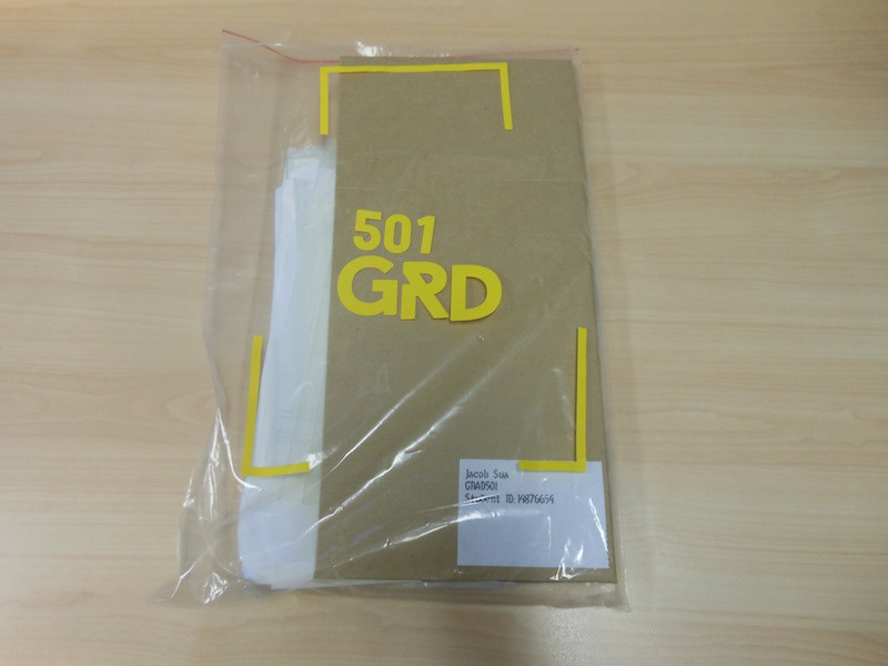
The Eflute was a hassle and boy I looked like an idiot looking at a piece of cardboard wondering what to do with it for hours on end. Yeah apparently we were supposed to construct the Eflute box to fit an A4 size booklet but that was not the only reason.
Turns out we also had to provide the actual artwork into the self made box as well which again looking at its shape that would have been impossible and it was those devil in the details contained in the brief provided that hung me up again (always proof read that brief people!)
So yeah my tutor is gonna be scratching his head as to why a elongated box was submitted with a tiny book a fraction of the size he requested.
So yeah my tutor is gonna be scratching his head as to why a elongated box was submitted with a tiny book a fraction of the size he requested.
Now the book was supposed to be A4 size but it didn’t turn out the way I wanted and due to time constrains, it ended not only being costly but I couldn’t run through the gamut again with the book binders.
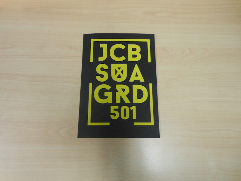
Also this book lacks a proper cover and I used a vinyl decal to make up for that.
Now lets look at the book itself. As I said before, I did like what I produced and when I conferred with a classmate, he liked what he saw too and again I am still open for others to critique without the “Design by committee” postulate.
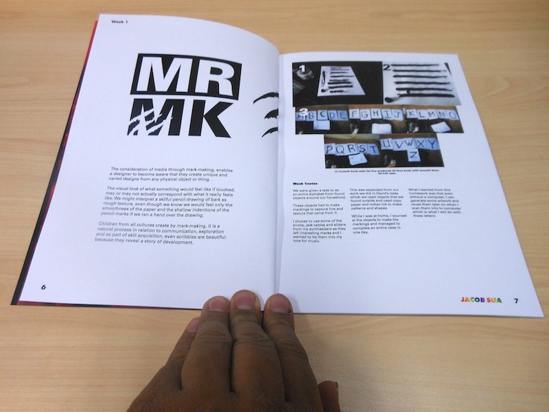
The layout I went for was along the lines of fashion or chic sensibilities given the fact that the contents is all based on art and creativity so a certain audience is in mind. With that said, I did look at a lot of magazines that fit that description and borrowing those layouts and grids.
Yes lots of white spacing is rampant in this publication but again it’s down to what has been bestowed to us, which was the treatment of negative space.
I know that I could break those rules and go big and daring but I need to learn more about composition and personally I am a proponent for bright colors too especially when looking at negative white can be boring to use as a device in graphic design.
Fonts I went with were san serifs but not too predictable choices for the body text which I used a Roman Univers 55.
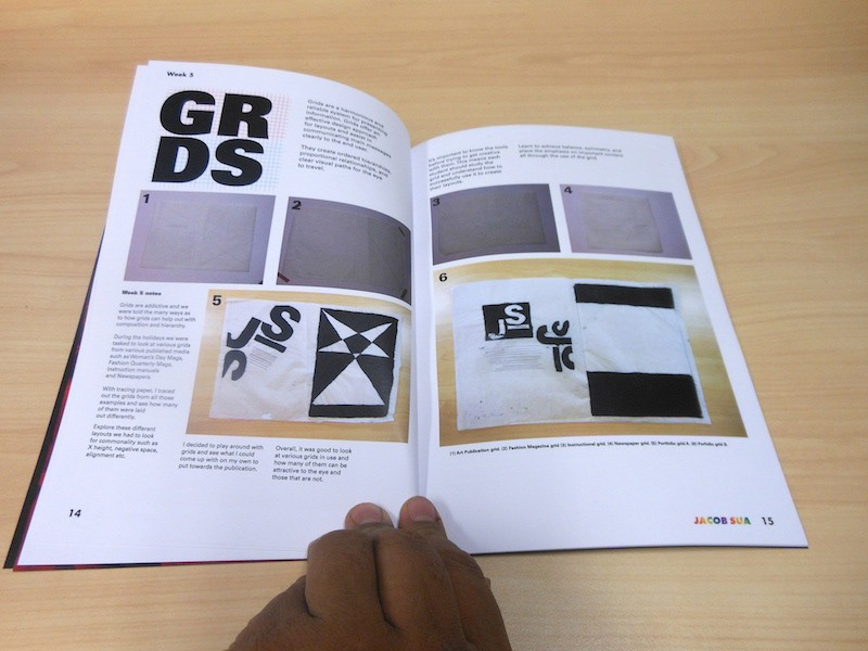
Shockingly some of the pictures I took from a regular run of the mill camera turned out okay even though some (like the ones I took for the grid page) were too small and the contrast wasn’t working for me that night.
Although I heard from the grapevine that JPEGS are okay to use in the final print, just to be on the safe side, I’ll remember to switch them to tiff next time around.
Reflections:
If I were to recant my experience doing this assessment it could be summed up with one important thing…devil in the details especially with the brief.
Sure I could have gotten away with creative freedoms such as my own take on how the book ended up looking but those details when it came to this assessment were important such as:
· Keeping it to A4 size
· Constructing the eflute container to that size especially the fact that I had to throw in some additional things such as the artwork that were featured in the publication.
· More effort should have been done for the cover when others demonstrated that it could be accomplished with great results.
· More color usage should have been integrated instead of boring white.
· Additional pages (probably up to 40) because it seems wasteful for Perfect bound.
· And lastly (and most important of all) time management!
Burn before you learn and whatever feedback I get from my classmates or tutors, I will take it in and learn from it. But I did enjoy making something that I yearn to do in a long time which was a publication.
Lets hope we revisit this field of assessment again in the near future.