This was my last assignment for the year at AUT (2015) which was to output a published book that talked about our neighborhood where we're from. From the people, to the places, interesting aspects, and so on.
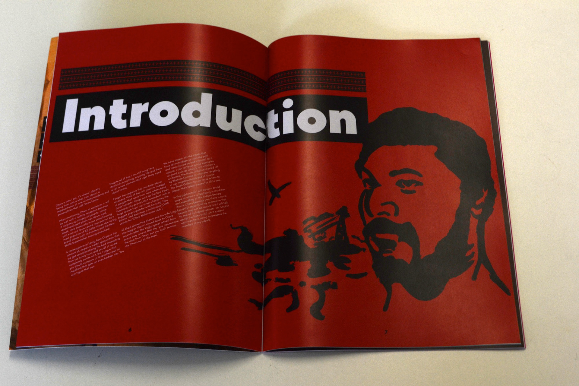
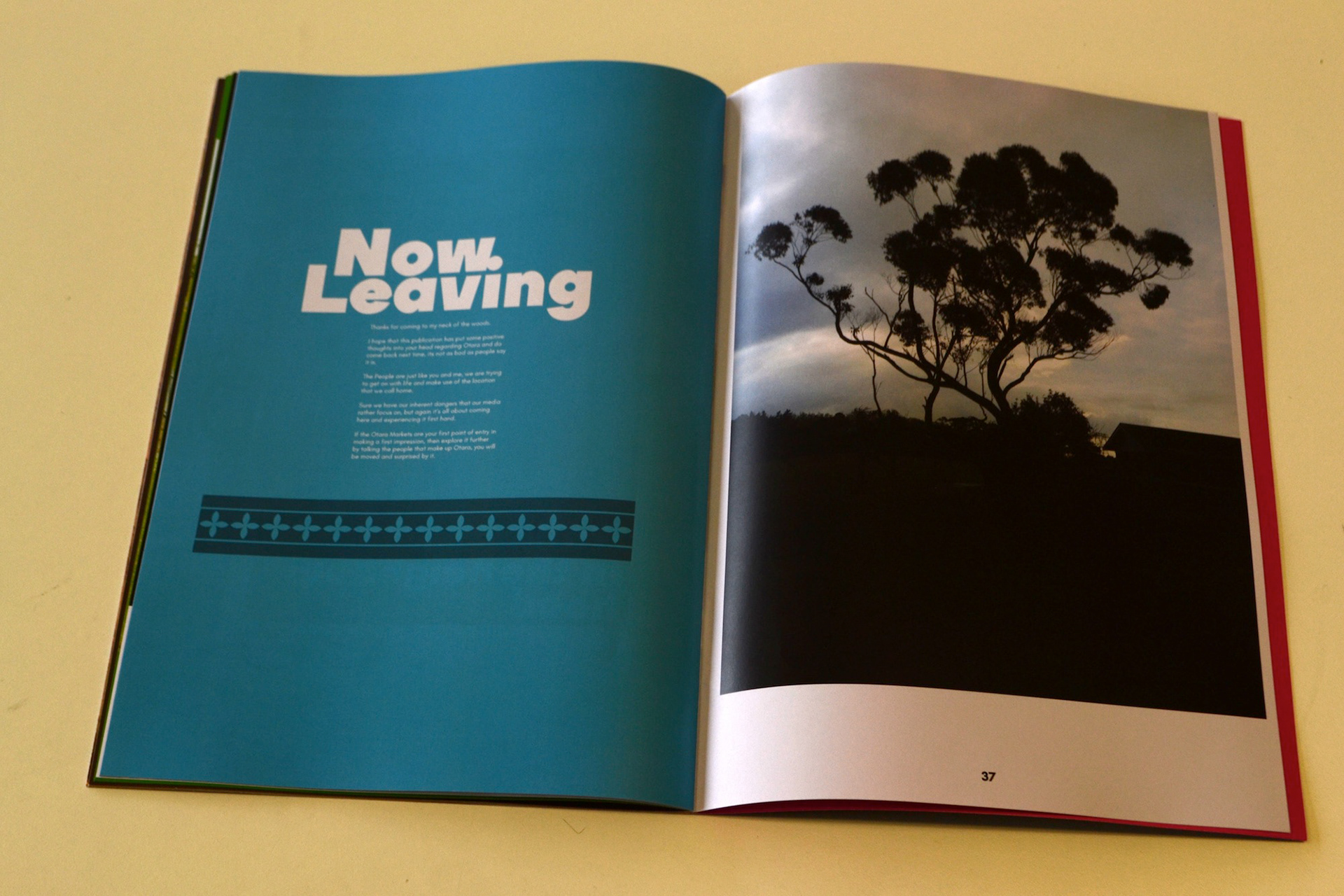
My focus is of course Otara (where I am from), which documents my journey from where I live right through to the Otara Town Center and back. So yes there is a slight narrative with my publication as it covers my trail within everyday life.
The brief asked for us to generate analog images, layout design, color, grids, and of course photography.
The printing process was digital as it would produce some exceptional results once I got it back from the printers. With digital being cheap it would replication those colors I gave to near perfect in a short amount of time and I am happy with the results.
However the paper stock is another matter because I stated that I wanted a non-glossy coat for the final job. These are the types of things you have to state to the printer otherwise they can screw the job up.
However the paper stock is another matter because I stated that I wanted a non-glossy coat for the final job. These are the types of things you have to state to the printer otherwise they can screw the job up.
Fonts used in the final pub were TT Firs Black for the headers and Glacial Indifference for the body text.
Although I detest white spacing, the rhythm and flow was consistence the whole way, well I hope it was.
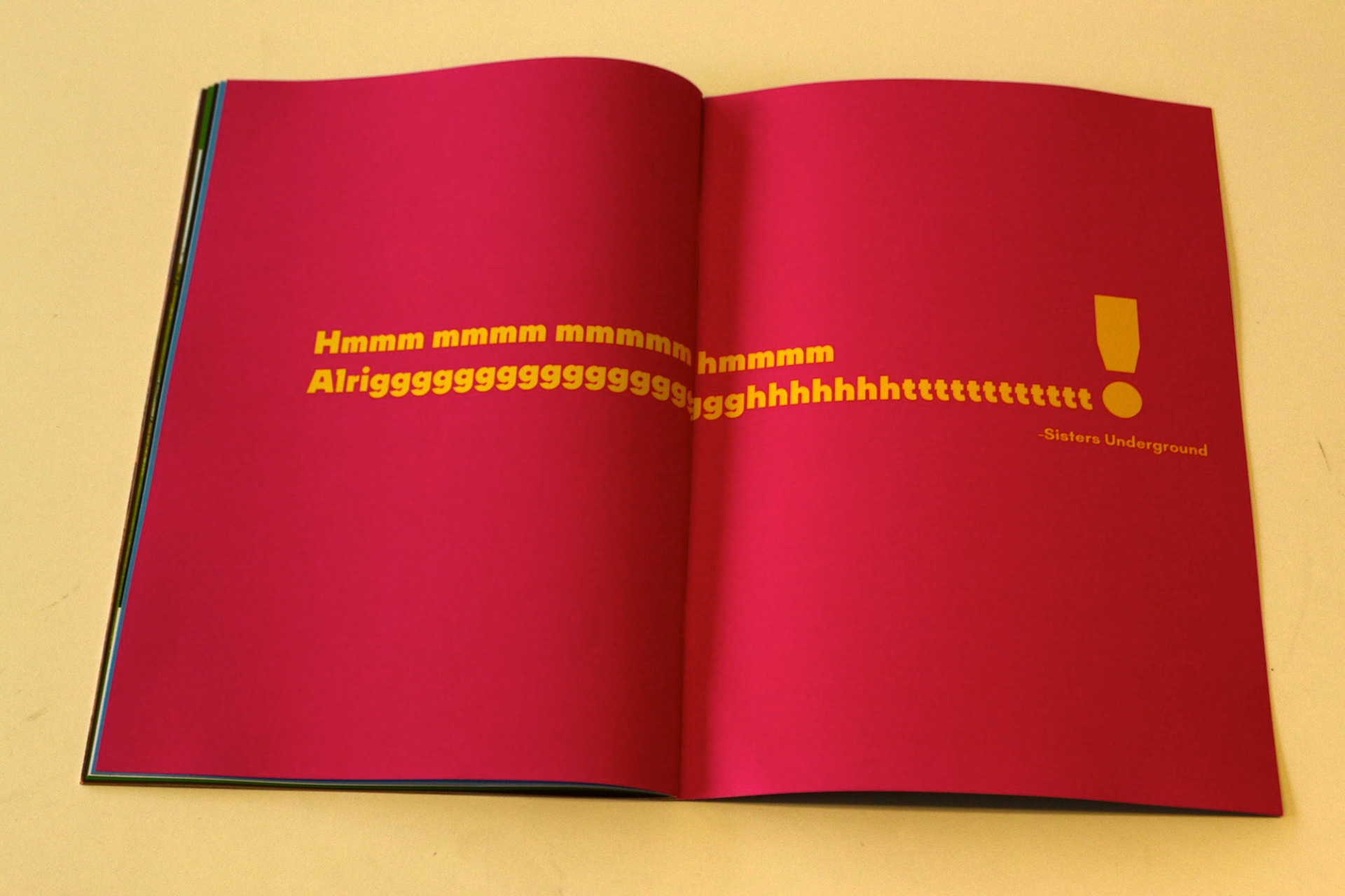
I also peppered in some quotes from the proud compilation from the likes of Sisters Underground and OMC and their timeless tunes to set of the overall theme.
Overall this was a rather trying project because I had to put both my stress levels and mental health on the line to get it done but it was worth it and I really loved the end result
I would like to pitch this to the Otara community board as an ongoing project cause I firmly believe that Otara needs a serious image reboot and this publication would be a good start.