This was the logo that I proposed for the Manukau Beautification Charitable Trust's BRAND IT contest. It made the final 4 but unfortunately lost coming in second for the "People Choice" with 197 votes and lost the overall contest.
LINKS:
http://www.beautifulmanukau.org.nz/Brand-it-competition.html
Artist Statement
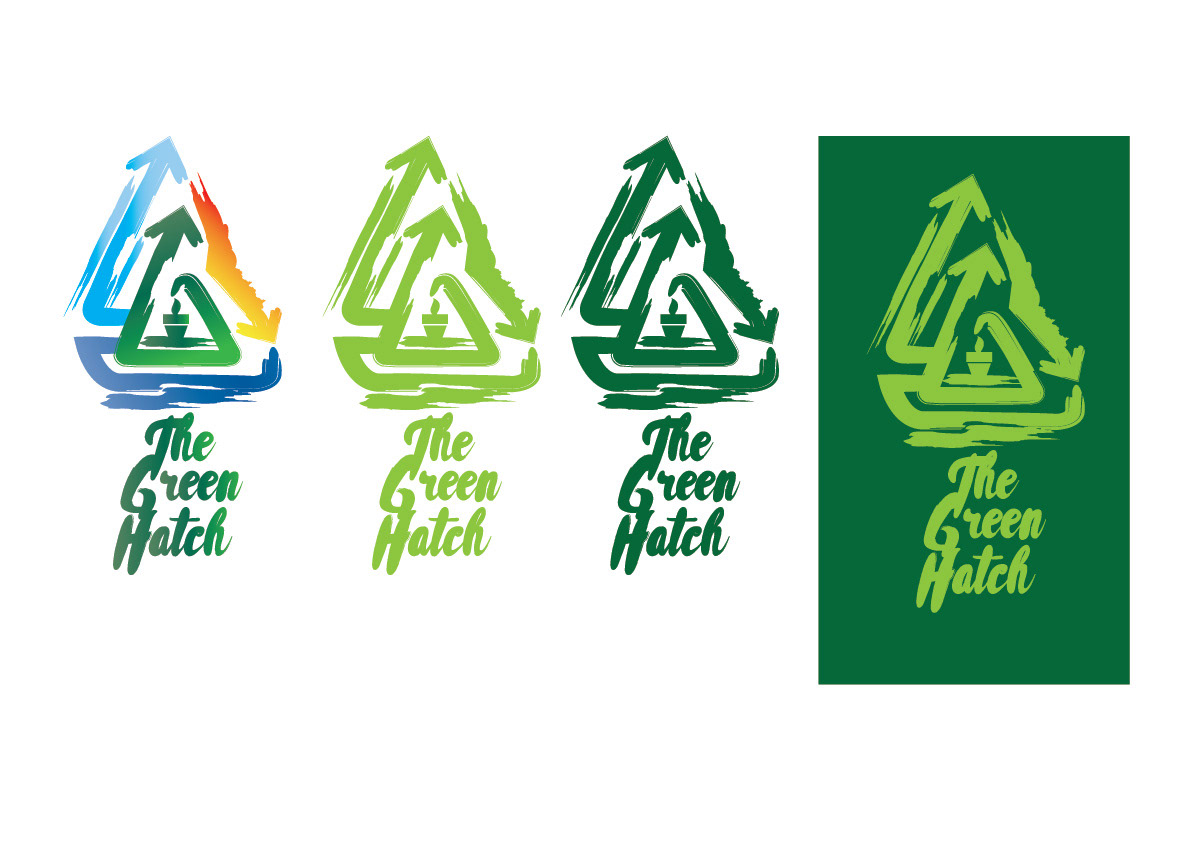
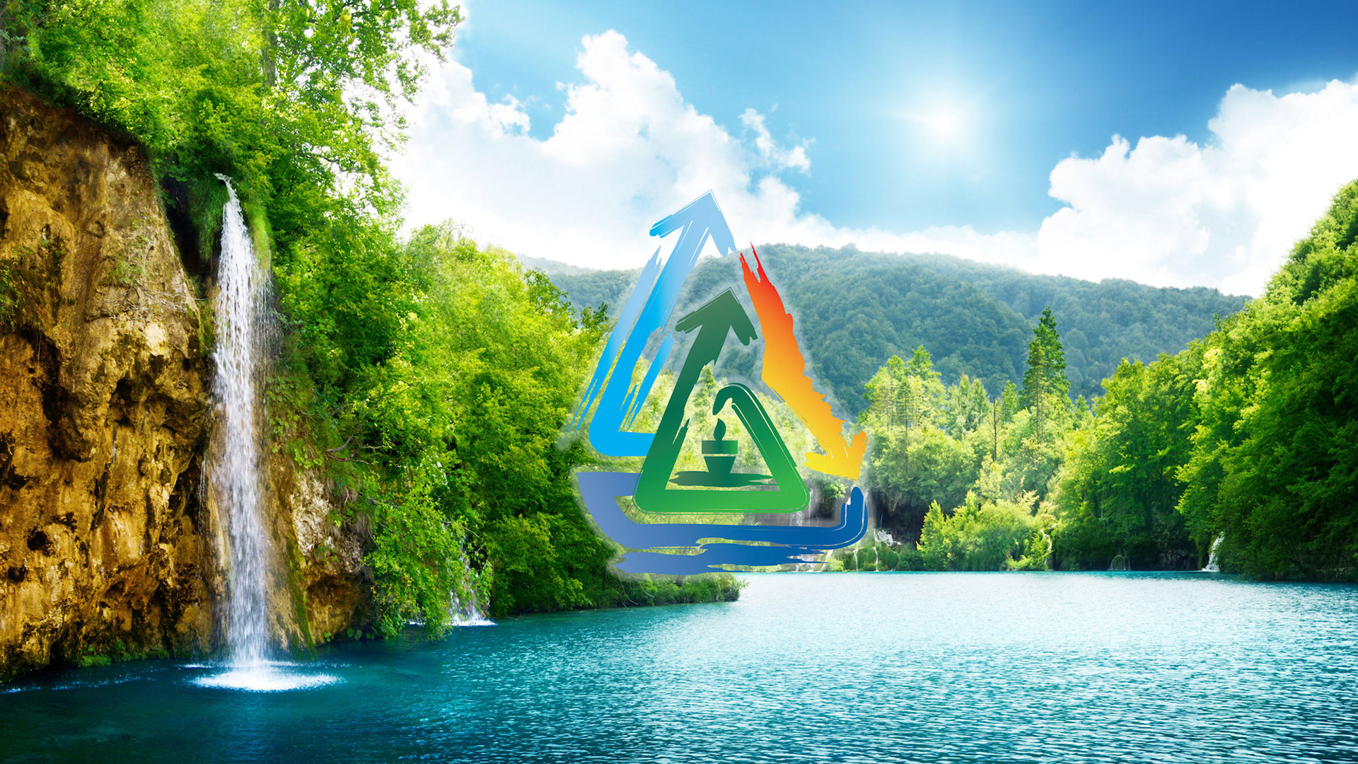
"The Green Hatch is the proposed name for the brand-it contest that I would like to pitch because I believe an idea or seeking a solution with regards to preserving the environment has an origin and in order for it to grow, it needs to be hatched.
LINKS:
http://www.beautifulmanukau.org.nz/Brand-it-competition.html
Artist Statement
"The Green Hatch is the proposed name for the brand-it contest that I would like to pitch because I believe an idea or seeking a solution with regards to preserving the environment has an origin and in order for it to grow, it needs to be hatched.
Much how when you think of an egg from a chicken, it is incubated nurtured and eventually birthed out of its shell ready for the world and the challenges ahead.
Originally the symbol of an actual egg was going to be the basis of my logo with a crack symbolizing “hatching”. However during the creative process I decided to keep the name of it and provide another visual to represent the logo, so I remixed the famous recycle symbol.
I used colors to represent Earth, Wind, Fire, and Water and I shaped the logo so it would look like an Erlenmeyer flask, which represents the practice of science and ecology as they go hand and hand.
Lastly the original logo was generic so I gave it an edge by using brush strokes and roughness to add texture because youth are creative thinkers that are free flowing."
THIS LOGO WILL BE AVAILABLE FOR SALE. IF INTERESTED DO CONTACT ME AT
nerdyframes@gmail.com
nerdyframes@gmail.com