Funny story about this catalog. I was tasked to do the type treatment for the profiles, which at first I didn't want to do because the year previous, someone who was tasked to do our printing of the catalog botched the job up and we ended up with these rather ugly looking catalogs which suffered from creep issues coupled with the horrible paper source that was used which caused it. THANK YOU THAT GUY! Broke my heart it did.
FFWRD to 2019 my good mate David van Vliet, who also works at AUT SOUTH did this wonderful iteration of the graduates catalog all done in house at the lab
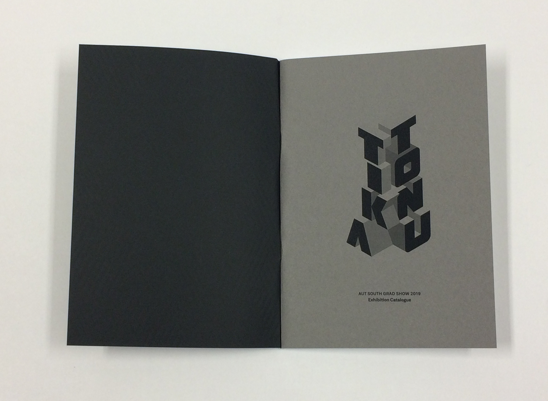
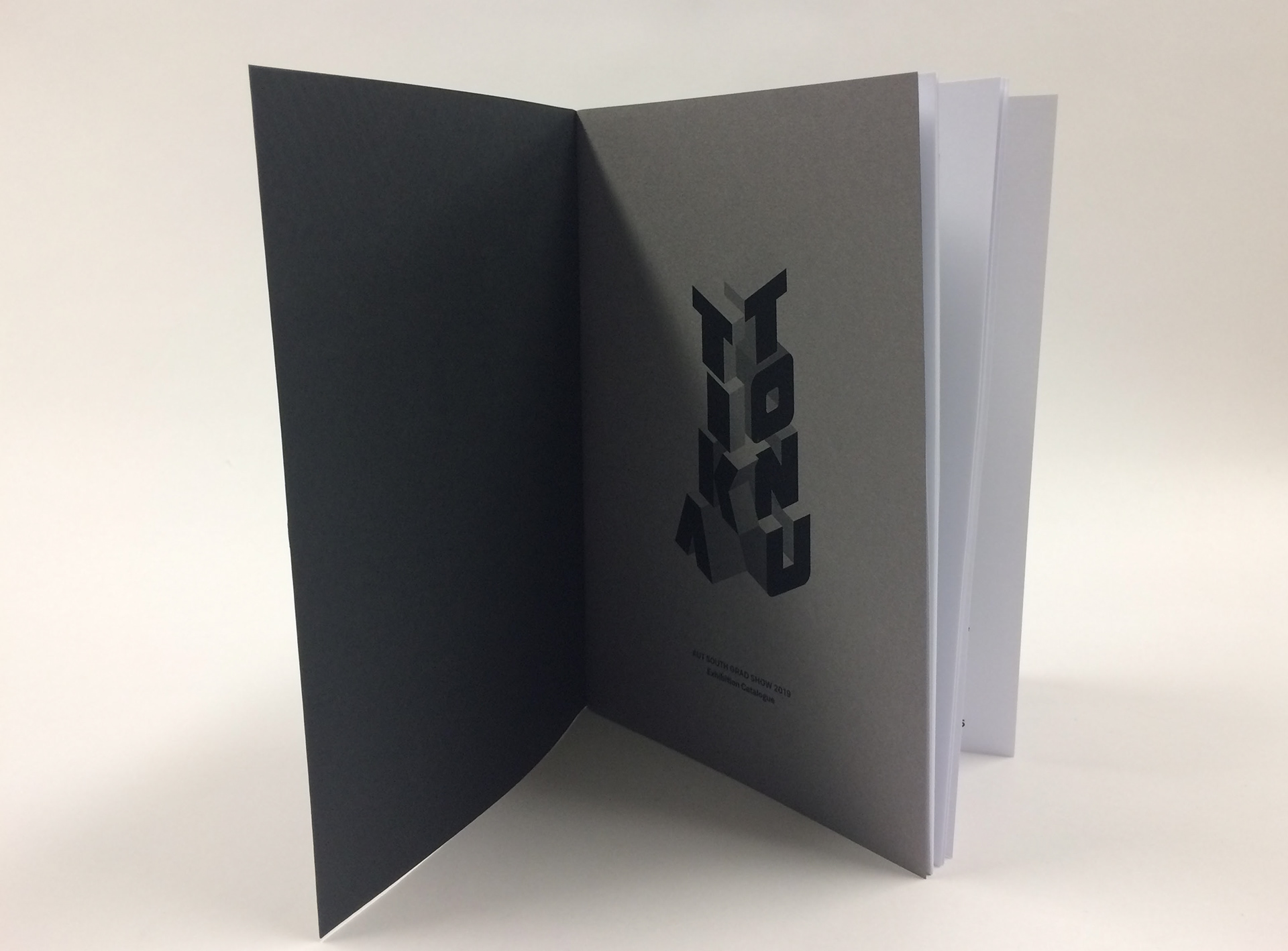
According to David, the spot print for the front was done using a conventional printer which I was blown away by given that pantone spots are rather expensive to employ in any publication you do. The cover had a raised impression coupled with using a textured thick card as the cover which again was done with a ordinary press that was at the lab.
This to me was a vast improvement on the catalog which I worked on doing all the laying out, formatting and type treatment. There was this sense of craft and tactileness when I obtained a copy of the final and I was very impressed and hopefully they will continue with being inventive and seeing the beauty of having limitations. Cause easily we could have just got this whole thing printed. But Im happy that it was done DIY